← Back to All Guides
A free guide by Lauren Dallas Instagram
Ugly Ads That Work Surprisingly Well
Why the ads you almost didn’t post might be the ones worth testing.
There’s a misconception in advertising that better-looking creative = better-performing creative.
But some of the ads that grab attention don’t look particularly polished at all.
They look like screenshots. Notes. Reviews. Random videos someone filmed on their phone. Product listings. Or graphics that look like they took approximately four minutes to make.
And that can be part of their appeal.
When someone is scrolling Instagram or Facebook, they’re surrounded by content created by real people. An incredibly polished ad can immediately announce:
“HEY! I’M TRYING TO SELL YOU SOMETHING.”
An “ugly” ad can blend into the behaviour of the platform instead.
The point isn’t to make bad creative.
It’s to stop assuming your ads need to look like ads.
But some of the ads that grab attention don’t look particularly polished at all.
They look like screenshots. Notes. Reviews. Random videos someone filmed on their phone. Product listings. Or graphics that look like they took approximately four minutes to make.
And that can be part of their appeal.
When someone is scrolling Instagram or Facebook, they’re surrounded by content created by real people. An incredibly polished ad can immediately announce:
“HEY! I’M TRYING TO SELL YOU SOMETHING.”
An “ugly” ad can blend into the behaviour of the platform instead.
The point isn’t to make bad creative.
It’s to stop assuming your ads need to look like ads.
01
The “Bad Design” Ad
What it looks like
Think big text, basic fonts, slightly awkward layouts, bright colours, arrows, circles, underlines and graphics that probably wouldn’t win a design award.
Sometimes it looks like someone opened Canva, dragged a few things around and called it a day.
And weirdly? That can be exactly what makes you stop.
Why it can work
Highly designed content has become incredibly easy to recognise as advertising.
A deliberately simple or slightly imperfect graphic can interrupt that pattern because it feels different from the beautifully art-directed ads surrounding it.
It also forces you to focus on the thing that matters most:
the message.
If the hook is strong enough, you don't necessarily need beautiful creative to make someone want to know more.
Try this:
Take one of your strongest hooks and make it the entire ad.
Use a basic background, huge text and one visual device - an arrow, highlight, circle or underline.
Then test it against your beautifully designed version.
You might be surprised which one wins.
Think big text, basic fonts, slightly awkward layouts, bright colours, arrows, circles, underlines and graphics that probably wouldn’t win a design award.
Sometimes it looks like someone opened Canva, dragged a few things around and called it a day.
And weirdly? That can be exactly what makes you stop.
Why it can work
Highly designed content has become incredibly easy to recognise as advertising.
A deliberately simple or slightly imperfect graphic can interrupt that pattern because it feels different from the beautifully art-directed ads surrounding it.
It also forces you to focus on the thing that matters most:
the message.
If the hook is strong enough, you don't necessarily need beautiful creative to make someone want to know more.
Try this:
Take one of your strongest hooks and make it the entire ad.
Use a basic background, huge text and one visual device - an arrow, highlight, circle or underline.
Then test it against your beautifully designed version.
You might be surprised which one wins.
02
The Lo-Fi Video Ad
What it looks like
An iPhone. Natural lighting. Someone speaking directly to camera.
Maybe you're sitting in your car, walking to get coffee, getting ready in the morning or showing the product in your kitchen.
There’s no elaborate production setup and sometimes barely any editing.
It looks like something you’d expect a creator or friend to post organically.
Why it can work
The feed is already full of casual, personality-led videos.
So when your ad uses the same visual language, there’s less of an immediate disconnect between content → advertisement.
It can also make the person behind the business feel more accessible.
Instead of thinking, “Here comes an ad,” you want someone thinking:
“Wait… what is she talking about?”
That extra second of attention matters.
Try this:
Open with the most interesting sentence first.
Not:
“Hi, I’m Lauren and today I want to tell you about…”
Try:
“I wasted SO much money doing this wrong.”
Then explain.
Keep the imperfect pauses. Keep some personality. You don't need to edit every breath out of it.
An iPhone. Natural lighting. Someone speaking directly to camera.
Maybe you're sitting in your car, walking to get coffee, getting ready in the morning or showing the product in your kitchen.
There’s no elaborate production setup and sometimes barely any editing.
It looks like something you’d expect a creator or friend to post organically.
Why it can work
The feed is already full of casual, personality-led videos.
So when your ad uses the same visual language, there’s less of an immediate disconnect between content → advertisement.
It can also make the person behind the business feel more accessible.
Instead of thinking, “Here comes an ad,” you want someone thinking:
“Wait… what is she talking about?”
That extra second of attention matters.
Try this:
Open with the most interesting sentence first.
Not:
“Hi, I’m Lauren and today I want to tell you about…”
Try:
“I wasted SO much money doing this wrong.”
Then explain.
Keep the imperfect pauses. Keep some personality. You don't need to edit every breath out of it.
03
The Screenshot Ad
What it looks like
This could be:
→ a customer DM
→ a testimonial
→ a review
→ a Notes app screenshot
→ a text conversation
→ a comment
→ a social post
→ a results screenshot
Sometimes the entire creative is literally just the screenshot.
Why it can work
Screenshots create curiosity.
We’ve been conditioned to read them because they usually contain information, conversation or proof.
And when that screenshot contains a customer's actual experience, the selling isn't necessarily coming directly from the brand anymore.
Your customer is helping make the argument for you.
Instead of writing:
“Our product gets amazing results!”
You can show someone saying:
“Okay… I genuinely wasn't expecting this to work THAT quickly.”
Much more interesting.
Try this:
Go through your DMs, testimonials, comments and reviews and look for statements that address a hesitation your potential customer might already have.
Don’t only look for praise.
Look for specificity.
The more concrete the experience, the stronger the creative can become.
This could be:
→ a customer DM
→ a testimonial
→ a review
→ a Notes app screenshot
→ a text conversation
→ a comment
→ a social post
→ a results screenshot
Sometimes the entire creative is literally just the screenshot.
Why it can work
Screenshots create curiosity.
We’ve been conditioned to read them because they usually contain information, conversation or proof.
And when that screenshot contains a customer's actual experience, the selling isn't necessarily coming directly from the brand anymore.
Your customer is helping make the argument for you.
Instead of writing:
“Our product gets amazing results!”
You can show someone saying:
“Okay… I genuinely wasn't expecting this to work THAT quickly.”
Much more interesting.
Try this:
Go through your DMs, testimonials, comments and reviews and look for statements that address a hesitation your potential customer might already have.
Don’t only look for praise.
Look for specificity.
The more concrete the experience, the stronger the creative can become.
04
The Amazon Listing-Style Ad
What it looks like
Product image.
Big benefit.
Star rating.
Review.
Price.
A few key features.
Maybe even little arrows pointing towards different parts of the product.
Essentially, you're borrowing the visual language of an online product listing.
Why it can work
There’s almost zero mystery.
Someone can glance at the creative and immediately understand:
WHAT it is.
WHO it’s for.
WHY they might want it.
WHAT other people think about it.
That clarity can be incredibly useful for products where the benefits are easy to communicate visually.
Rather than making someone work to understand your clever concept, you're putting the buying information directly in front of them.
Try this:
Build your creative like a mini product page.
Include your product, strongest benefit and one piece of proof.
Then ask:
If someone saw this for three seconds, would they understand why they might want it?
If not, simplify.
Product image.
Big benefit.
Star rating.
Review.
Price.
A few key features.
Maybe even little arrows pointing towards different parts of the product.
Essentially, you're borrowing the visual language of an online product listing.
Why it can work
There’s almost zero mystery.
Someone can glance at the creative and immediately understand:
WHAT it is.
WHO it’s for.
WHY they might want it.
WHAT other people think about it.
That clarity can be incredibly useful for products where the benefits are easy to communicate visually.
Rather than making someone work to understand your clever concept, you're putting the buying information directly in front of them.
Try this:
Build your creative like a mini product page.
Include your product, strongest benefit and one piece of proof.
Then ask:
If someone saw this for three seconds, would they understand why they might want it?
If not, simplify.
05
The “I Made This Myself” Ad
What it looks like
A plain background.
A sentence.
Maybe a photo.
Maybe a badly cropped image.
Maybe some text that isn't perfectly aligned.
The defining characteristic is that it feels human-made rather than campaign-made.
Why it can work
People don't necessarily need brands to look enormous anymore.
Sometimes seeing something that feels like it came directly from the founder, creator or person behind the business can make the communication feel more personal.
And because the creative is so simple, there’s nowhere for a weak idea to hide.
The hook has to do the heavy lifting.
Try this:
Write the sentence you’d send your friend if you were trying to convince them to try your product.
Put that sentence on the screen.
That's your starting point.
A plain background.
A sentence.
Maybe a photo.
Maybe a badly cropped image.
Maybe some text that isn't perfectly aligned.
The defining characteristic is that it feels human-made rather than campaign-made.
Why it can work
People don't necessarily need brands to look enormous anymore.
Sometimes seeing something that feels like it came directly from the founder, creator or person behind the business can make the communication feel more personal.
And because the creative is so simple, there’s nowhere for a weak idea to hide.
The hook has to do the heavy lifting.
Try this:
Write the sentence you’d send your friend if you were trying to convince them to try your product.
Put that sentence on the screen.
That's your starting point.
So… should you start making ugly ads?
Not exactly.
The takeaway isn't:
Make your ads uglier.
It’s:
Stop designing your ads based only on what looks good in your feed. Start designing them around what gets attention and communicates the offer.
A beautiful ad can perform brilliantly.
So can a screenshot that took you 30 seconds to make.
You won't know until you test.
And that's where creative variety becomes really important.
Instead of making five beautifully designed versions of essentially the same ad, test five completely different ways of communicating the same offer.
Polished vs lo-fi.
Founder-led vs product-led.
Designed graphic vs screenshot.
Video vs static.
Beautiful vs… just a little bit ugly. 😂
Because ultimately, the best-looking ad isn't necessarily the winner.
The ad that helps drive the result you're actually optimising for is.
I have a META Ads Masterclass where I share how I maximize my ads to bring back $3–$5 for every dollar I invest. You can click below to watch it for free.👇
The takeaway isn't:
Make your ads uglier.
It’s:
Stop designing your ads based only on what looks good in your feed. Start designing them around what gets attention and communicates the offer.
A beautiful ad can perform brilliantly.
So can a screenshot that took you 30 seconds to make.
You won't know until you test.
And that's where creative variety becomes really important.
Instead of making five beautifully designed versions of essentially the same ad, test five completely different ways of communicating the same offer.
Polished vs lo-fi.
Founder-led vs product-led.
Designed graphic vs screenshot.
Video vs static.
Beautiful vs… just a little bit ugly. 😂
Because ultimately, the best-looking ad isn't necessarily the winner.
The ad that helps drive the result you're actually optimising for is.
I have a META Ads Masterclass where I share how I maximize my ads to bring back $3–$5 for every dollar I invest. You can click below to watch it for free.👇
Free Training
Meta Ads Money Machine: How To Turn $1 Into $3–5 (On Repeat) With Meta Ads
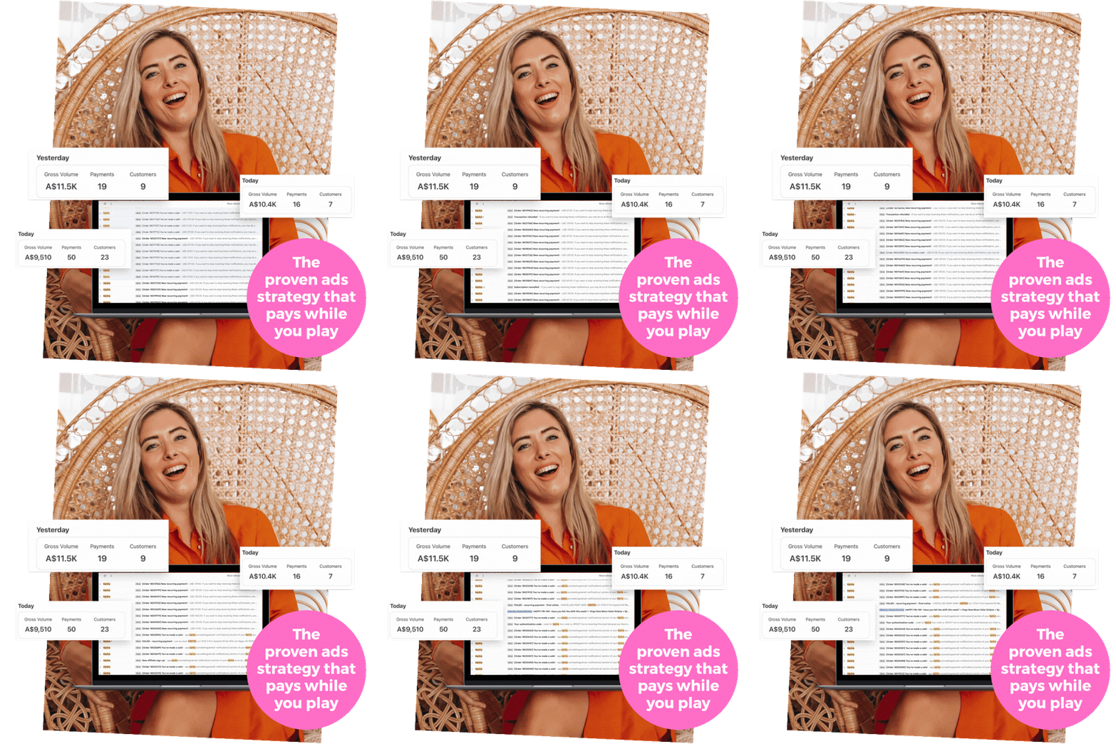
Stop waiting to "grow a following," and start growing sales. Discover my exact system for generating 1,000+ high-quality leads every month and 30+ daily sales from social media — even if you have zero followers.
In this session you'll learn:
✔ Why growing organically feels harder than ever, and the fix — the truth about what's really happening on social media, and why ads are the non-negotiable lever for consistency, sales, and scale
✔ The 3 profit plays that work on repeat — the proven strategies fueling 1,000+ leads a month in my own business, without thousands of followers or endless content
Real Results ★